Brand Guidelines
The Sprout Creative Kindergarten (Island East)
v6 · 2026-10-01
Internal draft for school review
Identity

Contents

This guide has 15 chapters, in the same order as the Hongkong Land brand guidelines.

It starts with who we are, then the logo, colour and type, and ends with specifications for each item.

01Identity
02Narrative
03Tone of voice
04Logo
05Symbol
06Typography
07Colour
08Layout
09Pattern
10Photography
11Material palette
12Stationery
13Applications
14Merchandise
15Boilerplate
Sprout Brand Guidelines v6 · Identity02
01

Identity

Our brand is made of a story, a mark, colours, type, layout and pattern. Every part does one job: helps families recognise Sprout at a glance.

Sprout Brand Guidelines v603
Identity

Design principles

We measure every design decision against three principles.

Design principle

Bright, open, sunny
Clear everyday routines
Not: showy

Bright
Design principle

Warm, kind, at eye level
Teachers beside children
Not: childish

Warm
Design principle

Curious, hands-on, try again
Children learn by doing
Not: preachy

Growing
Sprout Brand Guidelines v6 · Identity04
Identity

What makes our identity

Seven parts work together. Use only one or two and the brand falls apart.

Where curiosity grows
Narrative · what we say
Logo · our signature
Symbol · a flower on a book
Colour · taken from the mark
Aa 永
Typography · Univers + Noto Sans HK
Layout · left-aligned, generous space
Pattern · grown from the book
Photography · children in the moment
Sprout Brand Guidelines v6 · Identity05
02

Narrative

This is the story we tell families and the community: what we believe, what we promise and how we introduce ourselves.

Sprout Brand Guidelines v606
Narrative

Tagline

Our tagline is our shortest introduction. It comes from the mark: a flower growing on a book.

Sprouting on a book

How to use it

  • Chinese 「在書上萌芽」; English: Sprouting on a book.
  • Use on admissions posters, the website home page and slide covers.
  • No exclamation marks, quotation marks or other punctuation.
  • Don’t lock it to the logo. It stands on its own.

Tagline awaiting school approval.To confirm

Sprout Brand Guidelines v6 · Narrative07
Narrative

About us

Two lengths of introduction. Pick by space available; don’t rewrite them.

Short version

The Sprout Creative Kindergarten is a Creative Kindergarten group school. In Island East, we help children aged 2 to 6 learn through play and books.

Long version

The Sprout Creative Kindergarten (Island East), formerly the Island East campus of Kendall International Preschool, has joined the Creative Kindergarten group and builds on its more than forty years of early-childhood experience.

We believe curiosity cannot simply be taught. It grows where children feel safe and warm, with books and play close at hand.

From Pre-Nursery to K3, we grow with children through purposeful play, hands-on building, reading and writing, and time outdoors.

Sprout Brand Guidelines v6 · Narrative08
Narrative

Key messages

Four messages sit behind everything we publish. Back each one with a real example.

Children learn by doing

Example: learning cause and effect with blocks and marble runs.

Reading is the root

Example: daily reading-corner time.

Teachers at eye level

Example: teachers kneel to look together.

Growing with parents

Example: family sports day and parent workshops.

Sprout Brand Guidelines v6 · Narrative09
Narrative

Vision, mission and values

Our vision
Every child steps into the world curious and confident.
Our mission
A safe, warm place where children grow through play and books.

Care first

Safety and wellbeing come first; learning follows.

Let curiosity shine

Questions matter more than answers; try again.

Grow together

Teachers, parents and children on the same side.

Vision, mission and values are proposed drafts for school approval.To confirm

Sprout Brand Guidelines v6 · Narrative10
03

Tone of voice

We speak the way our teachers do: bright, warm, curious and trustworthy. Never showy, never childish.

Sprout Brand Guidelines v611
Tone of voice

Overview

Notices, admissions flyers and social posts all share one voice.

Bright

Cheerful days, clear routines.

One idea per sentence. Point first.

Warm

Teachers kneel to talk at eye level.

Say 'we', not 'the school'.

Curious

Ask first, then find out together.

Say what children did, skip the adjectives.

Trustworthy

Parents can see every step.

Real dates and numbers. If unknown, say so.
Sprout Brand Guidelines v6 · Tone of voice12
Tone of voice

Write this, not that

Write this ✓Not this ✗
You’re welcome to book a visit and meet our teachers.The school cordially invites esteemed parents to visit.
Ming built a bridge from big blocks. It stood on the third try.The children had a super amazing day!!
Hours and fees will be announced with 2027–28 admissions.Unbeatable fees, best value in Hong Kong.
Please return the slip by 15 October.Please return the slip ASAP, thanks for your cooperation.
Questions? Call the school office.Should you have any queries, kindly contact the school.
Sprout Brand Guidelines v6 · Tone of voice13
Tone of voice

House style

Adapted from the Hongkong Land house style for a kindergarten.

ItemStyle
Dates1 October 2026 (no 'st')
Times9:30am, 4pm (no space)
MoneyHK$1,200
NumbersSpell out one to nine; numerals from 10
Year groupsPre-Nursery (PN), K1, K2, K3

Chinese

  • Written Hong Kong Traditional Chinese, no Cantonese colloquial characters.
  • Full-width punctuation: ,。、「」
  • No space between Chinese and English; space between number and unit (10 mm).

English

  • British spelling: colour, centre, programme.
  • Sentence case for headings.
  • Avoid all-caps sentences.
Sprout Brand Guidelines v6 · Tone of voice14
04

Logo

Our logo is our signature. Used the same way every time, families recognise one Sprout on notices, uniforms and online.

Sprout Brand Guidelines v615
Logo

Our logo

The logo combines our symbol with the school name in English and Chinese. English sits above Chinese.

All logo use must be approved by the school office, which holds the master files.

Sprout Brand Guidelines v6 · Logo16
Logo

Logo versions

Two versions. Horizontal is preferred; vertical only for tall or centred layouts.

Horizontal (preferred) · letterhead, notices, web, slides
Vertical · posters, covers, banners
Sprout Brand Guidelines v6 · Logo17
Logo

Construction

The gap between symbol and name is 15% of the symbol width. The two text lines are left-aligned and match the symbol height.

1

Symbol: red box. Height = x.

2

Gap: 15% of the symbol width.

3

Name: green box, aligned top and bottom with the symbol.

Sprout Brand Guidelines v6 · Logo18
Logo

Language versions

Bilingual is standard. Single-language versions are for single-language materials only.

Bilingual (standard)
Chinese · Chinese notices, internal
English · English materials

Single-language versions are split from the master artwork; confirm before use.To confirm

Sprout Brand Guidelines v6 · Logo19
Logo

Clearspace

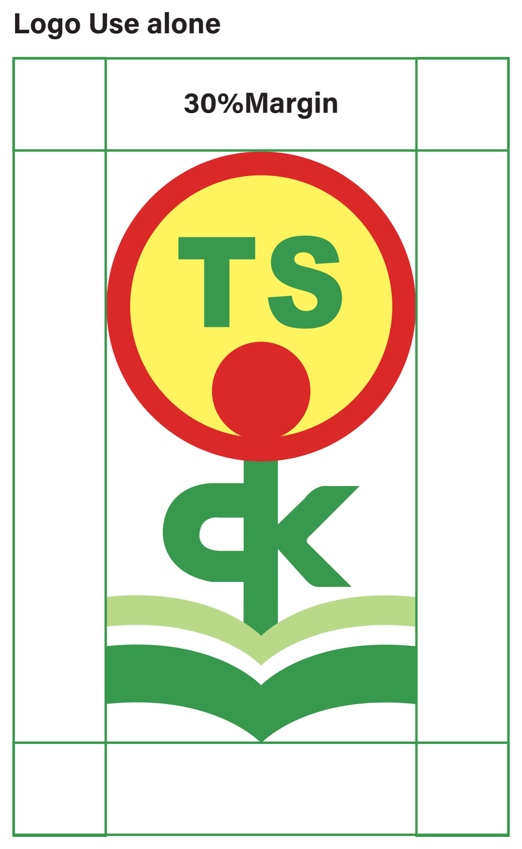
Leave at least 30% of the symbol width clear on every side. No text, photos or page edges inside it.

30% x
Sprout Brand Guidelines v6 · Logo20
Logo

Scaling

Ideally the logo is 25–35% of the layout width. Never more than 50% or less than 20%.

✓ 30%: ideal
✗ Larger than 50%
✗ Smaller than 20%
Sprout Brand Guidelines v6 · Logo21
Logo

Minimum size

Below these sizes the strokes of the name blur together.

UseWith nameSymbol
Print A4≥ 78 mm≥ 10 mm
Print A5≥ 53 mm≥ 7 mm
Digital≥ 200 px≥ 50 px
Signage≥ 300 mm—
Sprout Brand Guidelines v6 · Logo22
Logo

Positioning

Place the logo in a corner, usually top-left or bottom-left. Only the vertical version may be centred.

✓ Top left
✓ Bottom left
✓ Bottom right
✗ Horizontal centred
Sprout Brand Guidelines v6 · Logo23
Logo

Colour

Choose the version for its background. On photos, check the contrast first.

Full colour on cream
Full colour on white
White text on forest
All white on green
Ink text on light green
One-colour ink, copies
All white on dark photo
One-colour green, embroidery
Sprout Brand Guidelines v6 · Logo24
Logo

On backgrounds

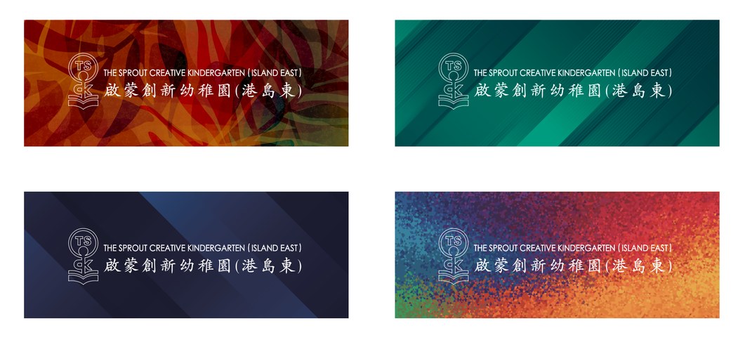
On busy photos, patterns and gradients, never use full colour. Use the white outline version.

White outline · school master artwork
Full colour + white keyline · dark grounds, keeps brand colour
Sprout Brand Guidelines v6 · Logo25
Logo

Which version

SituationVersion
Light groundFull colour
Dark groundReversed
Light, simple photoFull colour
Dark photoReversed or outline
Busy, colourful photoWhite outline
Over people or objectsWhite outline
Dark uniform, merchandiseReversed
StickersWhite outline
✓ White on photo
✓ Outline on busy photo
✓ White needs contrast
✓ White on dark stage
Sprout Brand Guidelines v6 · Logo26
Logo

Misuse

Never alter the logo. Use only the master files from the school office.

Don’t stretch
Don’t rotate
Don’t recolour
Don’t drop the symbol
Don’t rearrange
No shadows
No full colour on busy photos
Not on Sprout Red
Sprout Brand Guidelines v6 · Logo27
05

Symbol

Our symbol: a flower growing on a book. Each part means something; together they tell how a child grows.

Sprout Brand Guidelines v628
Symbol

Meaning

A

The flower: TS badge

Red ring for care, yellow for sunshine, green TS for growth.

B

The heart: red dot

The flower’s centre, and a small child’s head.

C

The stem: ck

ck becomes a sprouting figure.

D

The roots: an open book

The book is the soil where growth starts.

Sprout Brand Guidelines v6 · Symbol29
Symbol

Construction

In v5 the ring, sun and dot are redrawn as true circles, so the symbol stays crisp even at signage size.

Vector SVG (v5 redraw)
Circles and centre axis
Partof symbol width
Ring outer86.3%
Ring inner72.6%
Dot27.2%
Axisdot, stem and spine on one line
Sprout Brand Guidelines v6 · Symbol30
Symbol

Usage

Use the symbol alone for badges, stamps, avatars and favicons. The full name must appear elsewhere on the same item.

Social avatar
Favicon
One-colour stamp
White on green
Sprout Brand Guidelines v6 · Symbol31
Symbol

Misuse

Never split the symbol apart or add new elements.

Don’t distort
Don’t crop to the flower
Don’t recolour
No effects
Sprout Brand Guidelines v6 · Symbol32
06

Typography

Two typefaces, one for each language. Simple and clear, easy for parents to read.

Sprout Brand Guidelines v633
Typography

Typefaces

English and numbers

Univers for all English text and numbers.

Univers
AaBbCc 123
Chinese

Noto Sans HK follows Hong Kong character forms and is free to use.

思源黑體
在書上萌芽
Sprout Brand Guidelines v6 · Typography34
Typography

Weights

Use two weights only: Light for body, Regular for headings. No bold.

Light 300 · body
Children learn by doing
Regular 400 · headings
Children learn by doing
Sprout Brand Guidelines v6 · Typography35
Typography

Type scale

One scale for everything. Headings are at least twice the body size.

LevelSizeLeadingSample
Display36–44 pt1.1Sprouting
Heading20–24 pt1.2Four year groups
Intro13–14 pt1.5Our children learn by doing.
Body10–12 pt1.6Families are welcome to book a visit.
Caption8–9.5 pt1.45Photos courtesy of Creative KG
Sprout Brand Guidelines v6 · Typography36
Typography

Bilingual setting

When paired, English sits above Chinese, both left-aligned. Set Chinese about 10% larger so they look the same size.

Sprouting on a book
在書上萌芽
Our children learn by doing.
我們的孩子從做中學。
  • English 24 pt → Chinese 26.5 pt
  • 2 mm between the two lines
  • Don’t run both languages on one line
  • Simplified Chinese: Noto Sans SC
Sprout Brand Guidelines v6 · Typography37
Typography

Alignment and misuse

Align text left. Only the vertical logo and short poster titles may be centred.

Children learn by doing
Purposeful play builds thinking.
✓ Left-aligned
CHILDREN LEARN BY DOING
✗ Justified or all caps
Children learn
✗ Bold or italic
Children learn
✗ Other fonts or coloured text
Sprout Brand Guidelines v6 · Typography38
07

Colour

Our colours come from the mark: red, yellow, green and light green. Cream underneath lets them shine.

Sprout Brand Guidelines v639
Colour

Primary neutrals

Cream, white and ink are our foundation. Most layouts are built on them.

CreamCMYK 2/5/15/0RGB 249/240/220HEX #F9F0DC
WhiteCMYK 0/0/0/0RGB 255/255/255HEX #FFFFFF
InkCMYK 70/50/80/70RGB 31/42/27HEX #1F2A1B
ForestCMYK 85/40/95/30RGB 42/107/58HEX #2A6B3A
Sprout Brand Guidelines v6 · Colour40
Colour

Brand colours

Four brand colours for energy and growth. Print to the CMYK values exactly.

Sprout RedCMYK 10/98/100/0RGB 218/41/40HEX #DA2928
Sun YellowCMYK 0/0/75/0RGB 255/244/95HEX #FFF45F
Growth GreenCMYK 80/21/94/0RGB 56/152/78HEX #38984E
Sprout LightCMYK 30/0/60/0RGB 185/217/137HEX #B9D989
Sprout Brand Guidelines v6 · Colour41
Colour

Tints

Brand colours can be used at 60%, 30% and 15% for charts and backgrounds.

Red 100%
60%
30%
15%
Yellow 100%
60%
30%
15%
Green 100%
60%
30%
15%
Light 100%
60%
30%
15%
Sprout Brand Guidelines v6 · Colour42
Colour

Pairing

Text needs enough contrast: at least 4.5 : 1 for body, 3 : 1 for large headings.

Sprouting
Children learn by doing.
Ink on cream · 13.2 : 1 · all text
Sprouting
Children learn by doing.
Forest on cream · 5.7 : 1 · body, headings
Sprouting
Children learn by doing.
White on forest · 6.4 : 1 · body, buttons
Sprouting
Children learn by doing.
White on red · 4.9 : 1 · buttons, tags
Sprouting
Children learn by doing.
Ink on yellow · 13.1 : 1 · highlight boxes
Sprouting
Children learn by doing.
Green on cream · 3.2 : 1 · 18 pt and over only
Sprout Brand Guidelines v6 · Colour43
Colour

Proportion

Cream and white take 60%, Growth Green 20%; the other colours are accents. One accent per layout.

Cream / white 60%
Green 20%
Light 10%
6%
4%

✓ One accent per layout

Pick red or green as the poster’s lead colour.

✗ No red–green clash

Big red next to big green looks like a Christmas card.

✗ No yellow text

Sun Yellow is for backgrounds and accents only.

Sprout Brand Guidelines v6 · Colour44
Colour

Misuse

Sprouting
Yellow text on white
Sprouting
Red–green gradient
Sprouting
Red text on green
Sprouting
Off-brand colours
Sprout Brand Guidelines v6 · Colour45
08

Layout

Our layouts are left-aligned with generous space. Content stays clear and children’s photos lead.

Sprout Brand Guidelines v646
Layout

Spacing

We lay pages out like a magazine: every element has room around it.

Come and
visit us
✓ Title and logo on one left edge, space all round
Admissions
4
year groups: PN, K1, K2, K3
✓ One big number, one message
Sprout Brand Guidelines v6 · Layout47
Layout

Spacing misuse

WELCOME TO SPROUT ISLAND EAST
Text fills the page
Margins too tight
Margins too tight
Centred
Scattered, no left edge
Sprout Brand Guidelines v6 · Layout48
Layout

Grid

Portrait A4 uses 6 columns; landscape and slides use 12. Margin = 6% of the short side.

A4 portrait · 6 columns · notices
A5 · 4 columns · flyers
16:9 · 12 columns · slides, web
Sprout Brand Guidelines v6 · Layout49
Layout

Type and image

Text and photos each get their own area. Text never sits on a child’s face.

Bubbles together
✓ Photo above, text below
Out of doors
Sun, air and climbing frames.
✓ Side by side
Christmas show
✓ Full-bleed, darkened base
Sprout Brand Guidelines v6 · Layout50
Layout

Image framing

Photos are rectangles. The open-book curve may form the bottom edge, echoing the mark.

✓ Rectangle
✓ Open-book bottom edge
✗ No circles or stars
Sprout Brand Guidelines v6 · Layout51
Layout

Micro detail

Small details keep pages tidy: folios, rules and labels are always handled the same way.

Sprout · Notice03
Footer: hairline + folio
Learning
Hands-on
Kicker + title
K1 · 3–4 yrs
Tags: light green
40+
Key number: yellow dot
Sprout Brand Guidelines v6 · Layout52
09

Pattern

Our pattern grows from the open book in the mark: page after page, in a calm rhythm.

Sprout Brand Guidelines v653
Pattern

Construction

One book per cell, alternate rows offset by half. Spacing = 1.6× the book width.

↓
Sprout Brand Guidelines v6 · Pattern54
Pattern

Colourways

Cream · preferred
Green · covers, banners
Light green · wrapping, stickers
Sprout Brand Guidelines v6 · Pattern55
Pattern

Usage

Use the pattern as a background or border band. Never under text or over children’s photos.

Parent notice
✓ Notice header band
✓ Cover with a clear panel
Text on pattern
✗ Text straight on the pattern
Sprout Brand Guidelines v6 · Pattern56
10

Photography

We photograph children in the moment: playing, trying, laughing. Always from their eye level.

Sprout Brand Guidelines v657
Photography

Scale

A set needs wide, mid and close shots, like a complete story.

Wide · place: rooms, hall, playground
Mid · together: building, trying
Close · feeling: a smile, small hands
Sprout Brand Guidelines v6 · Photography58
Photography

Six themes

Each term’s photos should cover these six themes.

Hands-on
Reading and writing
Outdoors
Shows and festivals
Teachers and children
With families
Sprout Brand Guidelines v6 · Photography59
Photography

Light and composition

Natural light, bright frames, tidy backgrounds and a clear subject.

✓ Natural light, eye level
✓ A focused moment
✗ Too far to see the children
✗ Over-edited
Sprout Brand Guidelines v6 · Photography60
Photography

Privacy and specs

Privacy

  • Only photos with written parental consent.
  • No full names, no visible name tags.
  • Never changing, toileting or upset moments.
  • The school office checks before release.

Specifications

Print≥ 300 dpi · JPEG/TIFF
Web2400 px · JPEG 80%
Social1080 × 1350 px
File name2026-10-01_K1_outdoor_01.jpg
Sprout Brand Guidelines v6 · Photography61
11

Material palette

Materials should be durable, safe and warm to touch: cream paper, light wood and canvas.

Sprout Brand Guidelines v662
Material palette

Paper and materials

Choose recycled or FSC-certified paper. Anything children handle must meet child-safety standards.

Cream uncoated · 120 gsm · letters, notices
White matt · 300 gsm · cards, certificates
Light oak · signs, display
Natural canvas · totes, bags
ProcessUse
Offset CMYKflyers, booklets, posters
Screen printtotes, T-shirts, bottles
Embroideryuniforms, caps (green or full colour)
Laser engravingwood signs, trophies
Sprout Brand Guidelines v6 · Material palette63
12

Stationery

Letters, cards, notices and certificates are the Sprout families hold most often.

Sprout Brand Guidelines v664
Stationery

Overview

Sprout Brand Guidelines v6 · Stationery65
Stationery

A4 letterhead

2–8 Greig Road, Quarry Bay
Tel TBC
ItemSpec
Size210 × 297 mm
Margins≥ 15 mm
LogoHorizontal, top left; 55 mm (min 35 mm)
Details8 pt, Forest
BodyNoto Sans HK / Univers Light 10 pt
Footer5 mm green band (optional)
PaperCream uncoated 120 gsm
Sprout Brand Guidelines v6 · Stationery66
Stationery

Business card

Chan Tai Man
Principal
+852 0000 0000
Front
Back · pattern
Size90 × 54 mm
PaperWhite matt 300 gsm
Name8.5 pt Regular
Title, phone7 pt Light
Sprout Brand Guidelines v6 · Stationery67
Stationery

Parent notice

Family sports day
Notice 2026/27-015 · 1 October 2026
Reply slip
ItemSpec
Header16 mm pattern band
Title18 pt Regular
Ref, date9 pt, grey
Body11 pt Light, 1.6 leading
Reply slipdashed rule, bottom quarter

Notices are made from a Word template held by the school office.Template to do

Sprout Brand Guidelines v6 · Stationery68
Stationery

Folder and covers

SizeA4 + 5 mm
CoverGrowth Green, pattern on the top 60%
TaglineSprouting on a book, white Light
LogoAll white, bottom left
Sprout Brand Guidelines v6 · Stationery69
Stationery

Certificate

Certificate of Graduation
Presented to
2026–27
SizeA4 landscape
LogoVertical, centred
PaperCream 250 gsm
Border0.5 pt Growth Green rule
Sprout Brand Guidelines v6 · Stationery70
Stationery

Digital templates

Parent talk:
learning through play
Slide cover 16:9
How we learn
Four ideas
Play
Building
Reading
Outdoors
Slide content page
Chan Tai Man · Principal
The Sprout Creative Kindergarten (Island East)
+852 0000 0000
Email signature · logo 200 px wide
2027–28
admissions
Social posts 1080 × 1080
Sprout Brand Guidelines v6 · Stationery71
13

Applications

Our mark leaves the page: on signs, banners, the website and phones.

Sprout Brand Guidelines v672
Applications

Signage

MaterialLight oak + screen print
LogoHorizontal, ≥ 300 mm
Room signsSymbol + class name at 1.2 m
Sprout Brand Guidelines v6 · Applications73
Applications

Banners

Roll-up850 × 2000 mm
LogoVertical, top quarter
BannerWhite outline over photos
Banners · school artwork
Sprout Brand Guidelines v6 · Applications74
Applications

Website

Header height95–100 px @1440
LogoHorizontal, about 56 px tall
NavigationAbout, Learning, Programmes, Parents, Admissions
Language繁 · 简 · EN
Livetsck.creative-kg.xyz
Sprout Brand Guidelines v6 · Applications75
Applications

Mobile and social

  • Mobile header: symbol and name only.
  • Social avatar: symbol on a white circle.
  • Posts lead with children; logo in a corner.
Sprout Brand Guidelines v6 · Applications76
Applications

Tablet

  • Tablets show the site in portrait, sharing the mobile layout.
  • Use a tablet to show the site at parent evenings and open days.
Sprout Brand Guidelines v6 · Applications77
14

Merchandise

The things families take home are our warmest touchpoints.

Sprout Brand Guidelines v678
Merchandise

Overview

Canvas tote · Symbol screen print, 120 mm
White T-shirt · Left-chest embroidery, 60 mm
Water bottle · Symbol print, 50 mm tall
School bag · Front-pocket symbol, 40 mm
Staff ID · Green band, white logo
Exercise books · Cream cover + green band
Sprout Brand Guidelines v6 · Merchandise79
Merchandise

Production

ItemSpec
Canvas toteSymbol screen print, 120 mm
White T-shirtLeft-chest embroidery, 60 mm
Water bottleSymbol print, 50 mm tall
School bagFront-pocket symbol, 40 mm
Staff IDGreen band, white logo
Exercise booksCream cover + green band

Children’s items must meet child-safety standards; no small detachable parts.

Sprout Brand Guidelines v6 · Merchandise80
Boilerplate

Boilerplate

Use this text for press releases, partner documents and the website’s About page.

中文

啟蒙創新幼稚園(港島東)是啟思幼稚園集團成員,前身為 Kendall International Preschool 港島東校舍。我們陪伴 2 至 6 歲的孩子,由幼兒班到高班,透過有目的的遊戲、動手建構、閱讀與書寫和戶外活動學習,承傳集團逾四十年的幼兒教育經驗。

English

The Sprout Creative Kindergarten (Island East), formerly the Island East campus of Kendall International Preschool, is a member of the Creative Kindergarten group. We welcome children aged 2 to 6, from Pre-Nursery to K3, who learn through purposeful play, hands-on building, reading and writing, and time outdoors, building on more than forty years of the group’s early-childhood experience.

Sprout Brand Guidelines v6 · Boilerplate81
Boilerplate

Open items

Once these are confirmed, the guide can be finalised.

#Item
1Switch the website to the artwork colours (#DA2928, #38984E)?
2Add Forest #2A6B3A for small text?
3Correct the poster spec 'A5 ≥ 530 mm' to 53 mm?
4Tagline 'Sprouting on a book' and the vision, mission and values?
5May single-language logos be used?
6School phone, official web address and email?
7Must the web header use SweiGothic Rounded?
8Who holds the vector logo master files?

This guide follows the structure and rule-writing of the Hongkong Land guidelines without using its logo or images. Application scenes are AI-generated with the school’s real artwork placed in.

Sprout Brand Guidelines v6 · Boilerplate82